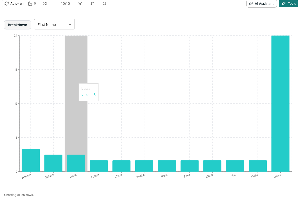
A table shown as a chart, breaking down one column.
Open the chart
1
Open the view menu
Open the view control in the toolbar.
2
Choose Show as chart
Choose Show as chart. The same menu offers Show as grid to switch back.
Pick a shape
Choose one shape at a time from the toolbar above the chart:- Breakdown, counting rows by a Column
- Numeric by category, comparing a Value across a Group by column, as a Sum or an Average
- Count over time, plotting rows by a Date column
What it draws
A chart always matches your filter and active view, since it draws the same rows the grid has loaded. A caption under it says how many rows are covered, and asks you to scroll for the rest if more are still loading.Good to know
What happens to a blank value in the charted column?
What happens to a blank value in the charted column?
A blank cell groups under (blank) for Breakdown and Numeric by category. Count over time drops a row with no date instead, since there is nowhere to place it on the timeline.
Does Average count blank cells as zero?
Does Average count blank cells as zero?
No. Average is computed only over rows that have a value in the value column, so blank cells never pull it down.
What happens once a column has too many distinct values?
What happens once a column has too many distinct values?
The smallest categories fold into a single Other bucket, so a chart never draws one bar per unique value.
Can I save a chart or export it?
Can I save a chart or export it?
No. Chart mode is a way of looking at your rows, not a saved property of a view. It is not part of what a saved view remembers.
Next steps
Views
Save the filter and sort a chart is drawing from.
Filter, sort and search
Change what a chart covers by narrowing the rows first.