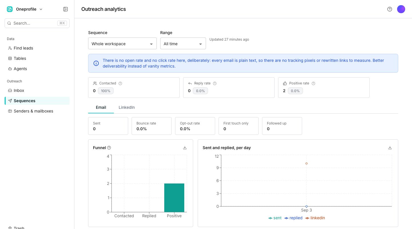
A sequence's analytics view.
Read the tiles and the charts
On Analytics, four tiles count Contacted, Replied, Positive and Bounced, and the bounce tile turns amber when it runs high. A sequence that tracks opportunities adds an estimated pipeline value. A daily chart plots sends and replies over time. Pick one sequence under Sequence and a Steps table breaks its results down by step, so you can see which email earns the replies. Each row names its step as the sequence’s Overview does, such as “Step 1 · Opener”.Compare senders
Email senders · all time ranks every sender worst performer first, and Show mailboxes on a row lists that sender’s mailboxes the same way. A mailbox dragging down deliverability surfaces at the top. Reply rate, bounce rate and opt-outs sit beside each one, and a bounce rate over the health threshold is flagged. LinkedIn senders · all time sits below it.See what was sent
Every email and LinkedIn message a sequence sends lands on its audience table, in a column named after the sequence, such as “Pipeline outreach: messages”. Each cell counts what went to that person. Open a cell to read every message as it went out. A formula or AI column can read that column, so you can pull out the last subject or spot a bounce. It exports with the rest of the table.Good to know
Why is there no open rate or click rate?
Why is there no open rate or click rate?
Oneprofile does not add tracking pixels or rewrite your links, so there is nothing to measure opens or clicks with. Reply rate and positive rate measure what actually happened instead.
What counts as a positive reply?
What counts as a positive reply?
A thread carrying a label marked to track as positive. Reply rate counts anyone who replied, while positive rate counts only threads labeled that way.
Where did the Sent emails table go?
Where did the Sent emails table go?
Sequences used to write every email to a separate table. If you have one, it stays in your Tables list and no longer updates. What a sequence sends now goes to the messages column on its audience table.
Can I see results for LinkedIn steps separately?
Can I see results for LinkedIn steps separately?
Yes. A tab above the charts switches the metrics and daily chart between email and LinkedIn, and LinkedIn senders get their own table.
When does an accepted connection request count?
When does an accepted connection request count?
Once Oneprofile has seen the acceptance, from the sender’s newest connections or a look at the person’s profile. Accepted on the LinkedIn senders table counts those, beside their share of the requests sent.Both checks run in the sender’s own browser, so keep one open with the extension up to date. See LinkedIn steps.
Next steps
Track opportunities
Put a dollar value on the replies a sequence produces.
Clear the launch checks
See what a sequence needs before it can send.